It is probably safe, at this distance in time, to confess. The PR who organised it is dead; those at Rémy Martin will have moved onwards, upwards, outwards. It was, in any case, not very important.
It was a tasting competition, you see. Rémy, via its then UK PR, sent out some tasting samples of various Cognacs. You tasted them at home, and then gathered together for a tasting somewhere else. You had, on the basis of what you had tasted previously, to identify the same Cognacs blind. Obviously, they were in a different order.
Tasting spirits is not easy: the alcohol tends to numb the palate (my palate, anyway), and if you add water to modify the numbing effect the taste is very different. Those who are dab hands at it have my deepest admiration. You think you’ve got it right, then you taste the next one, then go back and are utterly flummoxed, numb and despairing.
Well, obviously I didn’t want to make a total fool of myself. So I looked at the colours, which ascended in a nice even line. At the blind tasting I did the same thing: easy-peasy. And yes, I won. (The prize was a trip to Rémy, so it didn’t feel that different to what I did anyway.)
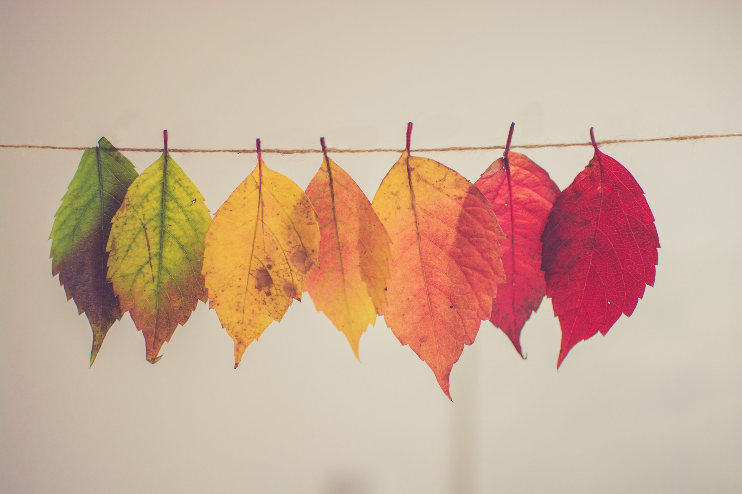
Colour gives lots of clues in blind tastings. Reds lose colour with age; whites get darker. But, you could argue, your nose and palate would tell you that much anyway. If they didn’t you’d be as unsuited to judge as I was in that Rémy tasting room.
Colour is pretty far down most winemakers’ lists of priorities these days. Adam Eggins of Australia’s Wakefield Wines loves a green, luminescent colour in his Riesling, which comes, he says, from low yields and cool, perfect summers. ‘We got it three or four times in the last decade,’ he says. Ideally he doesn’t want pale straw – pale straw being the normal description of most white wines. But Alvaro Palacios says, ‘we don’t bother about colour so much now; less than before’. That’s true, I would guess, of most red winemakers.
The ones who really care about colour are makers of rosé. Pink wine is still about colour before anything else. Yes, those vastly expensive pink wines from celebrity estates, made with perfect skill on perfect terroir (aren’t they?), which offer depth and complexity and freshness and (marketing department to fill in tasting note here) still have to conform to the pale shade of pink that has become the norm. Makers of non-vintage rosé Champagne who seek consistency year in, year out, have to decide whether they will prioritise consistency of colour or consistency of flavour, because you can’t have both. And rosé sells on its colour. We instinctively assume that a darker pink equals a richer, possibly jammy, rosé; paleness equals freshness. London wine merchant Charles Lea of Lea & Sandeman reports a niche sale for Larmandier-Bernier Rosé de Saignée Extra Brut Vertus NV ‘which was very dark and is still quite dark’, and says that in still wines Tavel and Spanish Clarete are coming back in small volumes, ‘but compared to the boatloads of MiP* [that’s a brand, and it stands for Made in Provence] it’s all a drop in the ocean.’
Orange wine should, by the same token, sell on its colour alone, and in that it is defined by its colour, it does. But volumes are small, styles are all over the place, and no one section of the orange spectrum has come to dominate – perhaps because orange wine has never, ever been associated with frivolity in any form.
Colour is suggestive, obviously. Rosés are often sold in clear glass, because in more protective coloured glass they look horribly murky. Blue glass is rare: Mar des Frades put its (white, obviously) Rías Baixas in blue bottles a few years ago and found that sales rose gratifyingly, not so much locally as on the Mediterranean coast of Spain. It looks fun, in its blue bottle, and it looks good on Instagram. It’s presumably not supposed to look serious.
Can you taste colour? In the sense that pink wines have a pale flavour of red fruits and reds have a darker flavour of red fruits, yes you can. But I did a tasting of rosé Champagnes in black glasses a few years ago, to see if there was a correlation between shade and flavour, and the answers were, to be polite, mixed. Partly this is because Champagne has to age, so that what starts off blue-pink has turned to salmon by the time it reaches your glass. Maceration fixes the colour better than blending, though. Laurent-Perrier’s Alexandra (made by maceration) tends to keep its amber-pink colour for years. Cristal Rosé can look like a faintly tinted white when it has a few years on the clock.
At that tasting (and I had tasters of the calibre of Christine Parkinson and Xavier Rousset) the mid-pink Gosset-Brabant Premier Cru Rosé was guessed to be both extremely pale and extremely dark by different tasters; so was mid-pink Moët Rosé Imperial, and so was pale pink Roederer Rosé 2008. Pale Bollinger NV was mostly judged to be darker than it was. Pommery Rosé Apanage, a delicate tawny-white, was thought to be dark to very dark. Only the shades of Delamotte Rosé and Veuve Clicquot Rosé were guessed with any degree of accuracy by everybody.
In the end, this doesn’t matter. Rosé Champagne, especially at the top end, is not intended to taste pink in the way that other rosé is. We shouldn’t take colour too seriously; unless we’re MW students it’s a pleasure, a decoration. The suggestiveness of colour is part of the pleasure. I tasted Alvaro Palacios’ glorious L’Ermita 2020 the other day, and I would swear that the aftertaste was blue-black in colour, like the bloom on a sloe. Complete auto-suggestion, of course.
For instruction on how really to judge colour in wine we must go to the grown-ups of the wine world, the OIV, or Organisation Internationale de la Vigne et du Vin. The OIV’s tasting sheets award 5 points out of 100 to limpidity and 5 for colour – as well as marks for such notions as typicality, quality, positive intensity, harmonious persistence and overall harmony. Both limpidity and colour come under the heading of ‘Visual/eye’, which is defined as ‘Discrimination of differences in outside world with sensory impressions from visible light rays.’ Colour, or ‘Aspect’ is defined as ‘to determine the full spectrum of visible properties of a product. This descriptor evaluates the intensity, the main colour of the product, its nuances (secondary colour), its viscosity, not taking into account its limpidity.’ To decide how to mark, given this definition, you must decide whether the wine in front you gives an ‘Excellent impression’ a ‘Very good impression’, a ‘Good impression’, a ‘Fairly good impression’ or a ‘Bad impression’.
Got that? Helpful, no? If you want to see the OIV tasting sheet in its full glory you can find it here. It reminds me of the centipede in the poem which, you will remember, goes like this:
‘A centipede was happy – quite!
Until a toad in fun
Said, “Pray, which leg moves after which?”
This raised her doubts to such a pitch,
She fell exhausted in the ditch
Not knowing how to run.’
Photo by Chris Lawson and Unsplash